
Sample Topic 1
You are advised to spend a maximum of 20 minutes on this task.
The table below summarizes some data collected by a college bookshop for the month of February 1995.

Write a report describing the sales figures of various types of publications, based on the information shown in the table.
You should write at least 150 words.
Sample Answer
The table shows the sales figures of fiction books, non-fiction books, and magazines in a college bookshop for February 1995. The figures are divided into two groups: sales to non-Book Club members and to Book Club members.
The non-Book Club member figures comprise sales to college staff, college students, and members of the public. College staff bought 332 magazines, 44 fiction and 29 non-fiction books. College students bought 1249 magazines, 194 non-fiction and 31 fiction books. More magazines were sold to college students than to any other group of customers. Although no fiction books were sold to members of the public, they purchased 122 non-fiction books and 82 magazines.
Book Club members bought more fiction (76) and non-fiction books (942) than other customers. On the other hand, magazine sales to Club members (33) were fewer than to any other type of customers.
The total number of publications sold for the month was 3134 (1474 to college students, 405 to staff, 204 to the public, and 1051 to Book Club members). Of this figure, 151 items were fiction books and 1287 were non-fiction. Therefore, magazines accounted for the greatest number of sales (1696).
Sample Topic 2
You should spend about 20 minutes on this task.
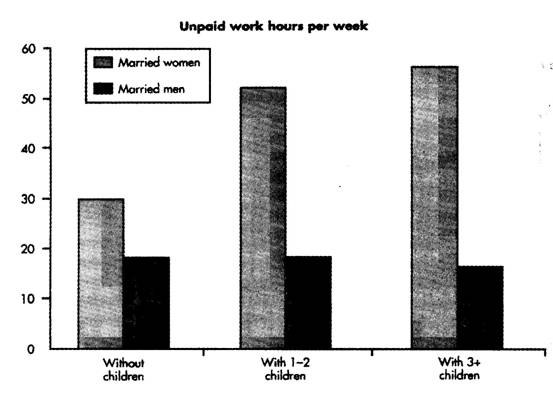
The diagram below shows the average hours of unpaid work per week done by people in different categories. (Unpaid work refers to such activities as childcare in the home, housework and gardening.)
Describe the information presented below, comparing results for men and women in the categories shown. Suggest reasons for what you see.
You should write at least 150 words.

Sample Answer
The diagram reveals that the number of hours per week spent on unpaid work is unequally distributed between men and women.
In households where there are no children, women are reported to work some 30 hours per week in such tasks as housework and gardening. Men's contribution to these unpaid jobs averages a considerably lower 18 hours.
When children enter the household, however, the inequality becomes even more pronounced. In families of 1~2 children, men maintain approximately the same number of hours of unpaid work as in childless households, but the number of hours women work in the home rises to 52 per week, much of it, no doubt, due to childcare responsibilities.
Interestingly, when there are three or more children in the household, men are found to work even fewer hours around the house than before the appearance of the third child. Whereas women's unpaid hours rise to approximately 56 per week, the corresponding figure for men, 16, actually represents a decrease.
The data suggest that the increased presence of women in the unpaid work force has not yet to lead to an increased role for men in the home.
Sample Topic 3
You should spend about 20 minutes on this task.
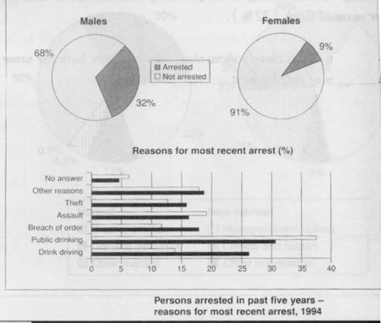
Generally, as public drinking and assault are concerned, females were arrested much less frequently than males. In other aspects, males are more likely to be arrested. The two pie charts show the proportion of males and females arrested and the bar chart shows the reason.
Write a report for a university lecturer describing the information in the table below.
You should write at least 150 words.

Sample Answer
The two pie charts show the proportion of males and females arrested and the bar chart shows reasons why they were arrested.
In general, females were arrested much less frequently than males and were arrested mostly for public drinking and assault, whereas males were more likely to be arrested for a range of other crimes.
The pie chart shows that about one third of the male population was arrested in 1994, while only nine per cent of the female population was arrested. The highest percentage of arrests of men, which was approximately 32%, was for public drinking. However, this percentage was less than the percentage of females arrested for the same reason, which was approximately 37%. Males were more commonly arrested for drunk driving, which constituted just over 25%, breach of order (about 17%), other crimes (approximately 17%) and theft (16%). Other offences in which females were more commonly arrested than males were for assault, where it constituted just under 18% of the arrests. Five per cent of men and about 6.5% of women refused to say why they were arrested.
It appears either that women are either more law-abiding than men or that law enforcement officers are more reluctant to arrest women.
Sample Topic 4
You should spend about 20 minutes on this task.
The table below shows social and economic indicators for four countries in 1994, according to the United Nations' statistics.
Describe the information shown below in your own words. What implications do the indicators have for the countries?
You should write at least 150 words.
Indicators CanadaJapanPeruZaire
Indicators |
Japan |
Canada |
Peru |
Zaire |
Annual income per person (in $US) |
15760 |
11100 |
160 |
130 |
Life expectancy at birth |
78 |
76 |
51 |
47 |
Daily calorie supply per person |
2846 |
3326 |
1927 |
1749 |
Adult literacy rate (%) |
99 |
99 |
68 |
34 |
Sample Answer
A glance at four indicators of economic and social conditions in four countries,Canada,Japan,PeruandZaire, in 1994 reflects the great differences that exist between wealthier and poorer nations.
The table shows that Japan and Canada had annual incomes of $15,760 and $11,100 per person, respectively. These figures were overwhelmingly greater than the corresponding figures of $160 in Peru and $130 in Zaire.
Health indicators, too, reflected overall levels of affluence in the four nations. Life expectancy at birth, for example, was higher among the more economically developed countries.Japanreported the highest life expectancy, 78. This was followed byCanada, 76;Peru, 51; andZaire, 47. This suggests that richer societies are able to put more money into health care than poorer ones.
The amount of calories consumed daily per person roughly followed the same ranking. Canadians each consumed some 3326 calories per day while the Japanese took 2846 calories. The corresponding figures forPeruandZairewere 1927 and 1749, respectively.
Literacy rates among adults, too, were higher in wealthier countries, no doubt a reflection of ability to invest in education.CanadaandJapanboth reported literacy rates of 99%, whilePeruclaimed 68%.Zaire, the least economically developed of the four countries, had a literacy rate of 34%.
The data appear to confirm the often cited link between national wealth and health and education standards.
版权所有:西安文理学院英语写作中心 地址:西安市科技六路1号 电话:029-87878787