
雅思图表写作讲义(七)
一总述
1任务要求:考生在20分钟内完成150个单词的小文章。
2内容:图表(line graph, bar chart, pie chart, table, diagram)
3文体:summary
4考察能力:客观地描述图形信息;
进行比较和对比;
对非个人性的话题提供报告,不掺杂个人意见;
使用图形描述语言。
Note:这里涉及到考试三原则——objectivity客观性原则(考生进行描述是不能有任何脸型式的个人观点),carefulness周密性原则(有时作文题会安排一个隐藏着的特征信息,考察考生的观察能力和横向比较能力,考生若能发现并加以描述,可以得到一个印象分,如没发现,则正常阅卷),accuracy精确性原则(考生须用准确生动的语言对数据进行描述)。
5考生对图表题所存在的三个问题:
Ø 对于写作当中的套用句掌握不充分
Ø 对于不同图表的破题思路存在问题
Ø 连接方面存在困难
二图表题总的认识
1各种题型的侧重点
运动趋势 |
曲线图 |
难点:把握曲线的走向和趋势 ——需要在第二段开头部分对整个曲线进行一个阶段式的总分类; 在分类描述每个阶段的specific trend同时倒入数据作为分类的依据 |
柱状图 |
难点:通过比较找出相同点,和对比找出不同点 ——即需要横向总结所有柱状图的共性特征,也要分别描写各个柱子的个性特征。 |
|
饼状图 |
比较好写,但要注意如何丰富百分比的表达和“占”的表达。 注:写作时不要一直用数字加百分比的格式,如25%,这样很难拿高分。特定的数字可以采用多样性的表达,如圆25%= a quarter of, 50%= half of,> 50%= a/ the majority of |
|
静止趋势 |
表格 |
考查列举数字的能力和方法,怎样通过一些有代表性的数据来说明问题。 |
2.图表作文结构
• 引言段:对图表主题作总介绍(关于什么主题的什么图/时间(1~2句)
• 正文段:
• 1)对图表进行总的概述或解说用(1~2句)
• 2)对图表所包含的信息进项详细的分析和比较(2~3段)
• 结尾段:对所描述的图表信息进行总结(1~2句)
•
三、图表题写作
1.审题:
• -先看文字信息-把握主题
• -再看图标信息-把握具体信息
• Eg.p28
• 横坐标:时间1950-1996(时态?)
• 纵坐标:数据(单位?)
• 图表标题:world grain harvested area,1950-1996
2.Introduction写作
通过改写题目(同义词转换,句式结构改変,增减细节)完成引言段写作
• Eg.请改写P28的题目
• 比较原题与改写后的introduction有什么不同之处:
• The graphbelow shows the area of land from which grain was harvested.
• This line graphabove illustrates the total world grain harvested areas in millions of hectaresbetween 1950 and 1996.
• 同义词转换:show- illustrate,reveal,depict, demonstrate, compare, give some information about…,
• 句式转换:the total grain harvested areas
• 增加细节:in millions of hectares , between 1950 and 1996
注意:为避免plagiarism,一定要对题目进行改头换面。Eg.
1) The two pie charts show the proportion of males and femalesin employment in 6 broad categories.  更换词语
更换词语
The two pie charts give the proportion of men and womenemployed in 6 broad areas.
2) The two pie charts showthe proportion of males and females in employment in 6 broad categories. 更换句式结构
• The two pie charts show,in 6 broad categories,the proportion of males and females in employment.
图表作文开头段落常见语言结构:
|
Type of chart |
Verb |
主题描述 |
The |
graph pie chart bar chart table illustration |
shows illustrates presents depicts reveals compare |
the number of… the proportion of… the information on … some data regarding /on … |
练习:
1.请为P30的线状图写引言段。
参考:The graphshows thenumber of West Indians and Indians and Pakistanisimmigrating to the UK from1940 to 1970.
2.请为以下的复合图写引言段。
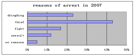
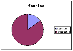
People arrested over the past 5 years


参考答案:
• The pie charts and the bar chart respectively present the proportion of males and females arrested over the past five years and some significant reasons why they were arrested in 2007.或
• The pie charts compare the proportion of males and females arrested over the past five years and the bar chart illustrates some significant reasons in2007.
3.主体段落写作
1)对图表的特点或趋势进行总的概述或解说(1~2句)
2)对图表所包含的信息进项详细的分析和比较(2~3段)
1)对图表的特点或趋势进行总的概述或解说-general statement即概述图表写作的最大特点或总趋势
Eg.P28线状图的总趋势
In general,the total harvest area increased until 1980, at which point there was a reduction in the area harvested due to retrenchment.
P30两条线的总趋势/总特点
As can be seen, immigration of both West Indians and Indians and Pakistanis increased rapidly over a twenty-year period. After 1960, the number of West Indian immigrantsdecreased sharply whereas the number of Indian and Pakistani immigrantscontinued to increase.
练习
请为以下复合图写作总概述
People arrested over the past 5 years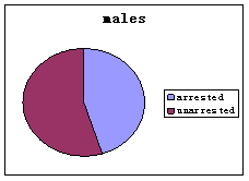
参考
According to the graph, more males than females were arrested and thief became the most common reason of arrest in 2007.
引出总概述的语言
• As can be seen, the most striking feature is …
• As is shown/depicted in the table, the most obvious feature is …
• From the graph, we can see clearly that…
• From the chart, it is apparent that…
• According to the graph,
• Generally speaking,
• It is noted that…
• Overall,…
2)对图表所包含的信息进项详细的分析和比较(2~3段)
2.1趋势图(线状图):
解题思路:按时间发展顺序写作;
语言点:四个方向的语言点-运动范畴,程度范畴,时间范畴,数据范畴与连接范畴.
运动范畴中存在着如下的8种运动趋向:
1.保持平稳:我们可以使用的套用结构有: stay stable/remain steady.
举例:表示人口数量保持平稳的时候可以写: the number of population stayed stable。/the number of population remained steady.
2.上升/增加:我们可以使用的套用结构有:rise/ climb/ increase/ ascend/mount/aggrandize(增加)
举例:人口上升:the number of population increased/ascended/mounted等等。
3.下降/减少:我们可以使用的套用结构有:fall/ drop/ decrease/ descend/ decline
举例:人口减少:the number of population decreased/ declined.
4..波动:这个就像我们的心电图一样。英语中叫fluctuate.
举例:人口波动:number of population fluctuated.
5.达到顶峰:peak/ reach its summit/reach its zenith
举例:人口到达了顶峰:number of population peaked/ reached its summit/ reached its zenith.
程度范畴:、
缓慢的/轻微的:gradually/ smoothly/ steadily/ slightly/moderately/slowly
陡然的/大幅度的:dramatically/ sharply/ considerably/ appreciably/ greatly/ steeply/ significantly/ markedly/rapidly/quickly/ suddenly/
举例:1.人口大幅度攀升:number of population mounted dramatically.
2.人口轻微下降:number of population decreased slightly.
3.人口逐渐下降:number of population decreased gradually.
数据范畴:
1) 上升/下降后面使用to(到)和by(了)
举例:
1.人口下降到200万: number of population decreased to 2 million.
2.人口下降了200万: number of population decreased by 2 million.
3.人口上升到1000万: number of population increased to 10 million.
4.人口上升了500万: number of population increased by 5 million.
2). remain steady/ stay stable/ level off/ bottom out/ peak/reach its peak/ reach its zenith后面需要使用的是at.
举例: 1.人口在500万上保持平稳:number of populationremained steady at5 million.
1.人口在800万时到达了顶峰:number of populationpeaked at 8 million.
2.下降后,人口在400万保持平稳:after decreasing, number of populationbottomed out at 4 million.
3.上升后,人口在700万保持平稳: after mounting, number of populationleveled off at 7 million.
3)fluctuate的后面大家需要连接between …..and…..
举例:人口在2和100亿之间波动:number of population fluctuated between 2 and 10 billion.(那俩人是ADAM和EVE)
练习:请描述一下线状图

参考答案:
The number of tourists increased greatly during the first 10 years from 1950 to 1960, reaching its peak at 100 in 1960. After an initial drop, the tourist numbers had kept steady at around 100 for 10 years between 1965 and 1975. It is noted that the following 30-year period saw an overall upward trend with some fluctuations.
常用4大句型:
1)sth + verb+程度+数据+时间。
The price increased greatly to 100 from 1950 to 1960.
2)sth+ verb的名词短语形式(含程度)+数据+时间。
The price experienced a great increase to 100 from 1950 to 1960.
undergo/ go through/suffer
3)there be +变化的名词+数据+in+某方面+时间。
There was a great increase to 100 in the tourist numbers from 1950 to 1960.
4)时间+见证+变化的名词+数据+in+某方面。
The 10-year period from 1950 to 1960 saw/ witnessed a great increase to 100 in the number of tourists.
总结:线状图解题思路
• 一条线:按时间发展顺序,选取有明显变化的趋势特征进行写作。
• 二条线:1)两条线各分两段。先写A线,再写B线。每条线按照其固有的特点完成描写,分析和比较。2)AB线同时比较着完成各自的特点描写。
• 三条线:1)先写A线。再对比着写B线和C线。2)三条线对比着写。
•
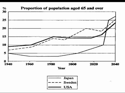
Eg
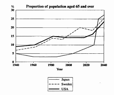
两条线(JapanVS sweden)分开来写:
Japan: stood at–dip into…before bouncing back to 5% again- be expected to shoot up to about 28% in 2040, the highest among the three countries
Sweden: increased gradually- grew with some fluctuations- be predicted to ascend to roughly 25%
对比着写:
Japan: stood at – dip into …before bouncing back to 5% again in 2000。Unlike Japen, sweden experienced a gradual increase in the number of aged people from around 9% in 1940 to roughly 14% in 1980. After that, the aged population in Sweden increased continually with some fluctuations, while Japan is expected to shoot up to about 28% in 2040, 4% higher than Sweden.
四.非趋势图
1.解题思路:???
——分类:找有意义数据(最大,最小,相同etc.)
2.必备语言点:百分比,大小比较,数据导入,先后顺序
2.1百分比的表示
• occupy
• gain
• share
• represent
• have/has
• constitute
• account for
• make up
• take up
• be divided into
• be allocated to
• be distributed to
如:
• The sales of chicken occupies 45% of the total.
• Beef and pork have the same percentage.
• 10% of the total sales is allocated to lamb.
• The smallest percentage is distributed to fish, which gains only 5%.
2.2大小比较
• 表示A比B….
• The sales of chicken is 40% more than that of fish.
• is 8 times more than that of fish.
• is 9 times of that of fish.
练习:请比较P41男性和女性在管理职位上的情况
• In managerial position, thenumberof the male is obviously more than that of the female.
• There are more men in managerial position than women.
• A greater number of men than that of womenwere found in managerial position.
• The number of menwho are employed in managerial position is much larger than that of womenworking in the same occupation.
• In managerial position, the company owned more men than women.
• 表示相同的
• A is equal to B.
• The sales of pork is equal to that of beef.
• A and B are equal.
• A is (exactly/ approximately) the same as B.
• The sales of pork is exactly two times the same as that of lamb.
• A is as …. as B.(表示倍数)
• The sales of chicken is above twice as much as that of beef.
• Pork sells twice as much meat as lamb.
• There are twice as many students in Class A as that of Class B.
• The figuresin terms of the daily calorie supply per head and life expectancy at birth in Bangladesh were only the half of those in USA in 1992
2.3数据引入
• ( )
• at
• Which引导的定语从句
• 分词结构
• With
• A versus B
• A as opposes to B
• respectively
eg
• The sales of chicken(45%) is 40% more than that of fish.
• The sales of chicken is 8 times more than that of fishat 5%.
• Pork and beef are equalat 20%.
• The sales of chicken is 9 times of that of fish,which occupies only 5%.
• The sales of chicken is 9 times of that of fish,occupying only 5%.
With的使用1)-引出一个数字
• Chicken has the highest percentage
• (45%).
• at 45%.
• , which represents about 45% of the total.
• , accounting for about 45% of the total.
• with 45% of the total being sold.
With的使用2)-“一拖几”
• More chicken (45%) is sold than any other kind of meat with pork and beef equal at 20%, lamb at 10%, and fish, th2 smallest, at only 5%.
• More chicken (45%) is sold than any other kind of meat with the same percentage (20%) in pork and beef ,10% in lamb, and only 5% in fish.
请完成以下句子。
• 鸡肉卖得比羊肉都多,45%比10%。
• Theproportionof chicken sold (45%)is obviously more than that of lamb(10%).
• More chicken is sold than lamb, 45% versus 10%.
• A larger percentage of chicken than that of lamb is sold, 45% as opposes to 10%.
• 鸡肉卖得比羊肉和鱼肉都多,分别是45%比10%和5%。
• Theproportionof chicken sold (45%)is obviously more than that of lamb(10%) and fish (5%).
• More chicken is sold than lamb and fish, 45% versus 10%,and 5% respectively.
• A larger percentage of chicken than that of lamb and fish is sold, 45% as opposes to 10% and 5% respectively.
请用所学过的知识点为该饼图写一段话
• 参考:先后顺序
• 最大/第一:gain the highest percentage
• rank first/second
• come top/top the list
• come out first
• shoot into the first place
• 其次:then,
• , followed by …
• comes there …
• 值得一提的是:it is noted that …
五、非常规图:
非常规图diagram (示意图)
1.静态图:
• 地图(location,direction, some other detailed information provided)
• 地理变化:P47
• 事物内部结构和功能P49
2.动态图P55
• 流程图:
• 循环图:P55
• The diagram illustrates the internal structure/function of sth.,
• Some information of doing sth.动态图
•
• 流程图:
• -the process of sth., which is designed to ..
• -how sth is produced, which serves as …
•
版权所有:西安文理学院英语写作中心 地址:西安市科技六路1号 电话:029-87878787